JSON Schema Pattern Samples
How to Configure JSON Extension Fields
Kuroco's content definition allows you to build flexible form UIs using JSON-type extended fields. This page introduces practical JSON Schema patterns that you can use.
The syntax of the JSON Schema used in Kuroco is based on https://json-schema.org/understanding-json-schema/basics . For the basic syntax, please refer to the JSON Schema documentation.
Basic Field Types
Select Box (String Selection)
{
  "type": "object",
  "properties": {
    "status": {
      "type": "string",
      "title": "Status",
      "description": "Please select the publication status of the content",
      "enum": ["draft", "published", "archived"],
      "default": "draft"
    }
  }
}
Display: Select Box (String Selection)
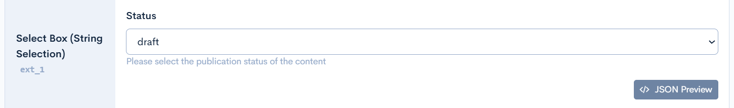
Note: When default is set, that value will be initially selected.
Select Box (Custom Display Labels)
{
  "type": "object",
  "properties": {
    "priority": {
      "type": "string",
      "title": "Priority",
      "enum": ["low", "medium", "high", "urgent"],
      "enumNames": ["Low", "Medium", "High", "Urgent"],
      "default": "medium"
    }
  }
}
Display: Select box (with custom labels)
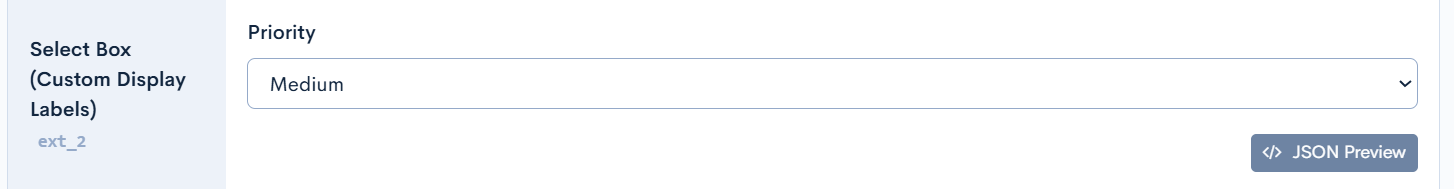
Note: By using enumNames, you can set display labels (e.g., "Low") that differ from the internal values (e.g., low).
Select Box (Numeric Selection)
{
  "type": "object",
  "properties": {
    "rating": {
      "type": "integer",
      "title": "Rating",
      "enum": [1, 2, 3, 4, 5],
      "enumNames": ["★", "★★", "★★★", "★★★★", "★★★★★"]
    }
  }
}
Display: Select box (numeric)
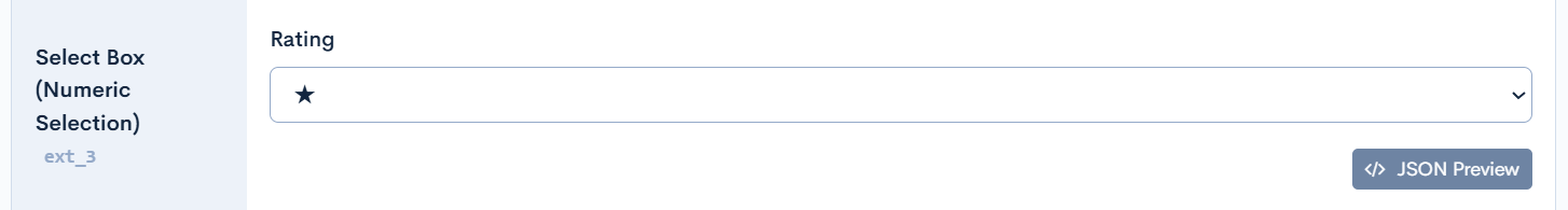
Note: For Number/Integer type enums, when default is not set, the first value is automatically selected.
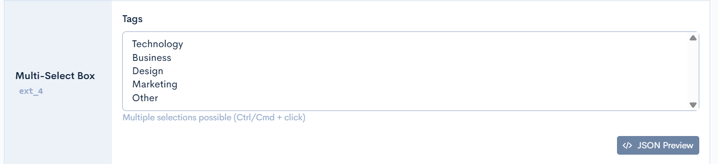
Multi-Select Box
{
  "type": "object",
  "properties": {
    "tags": {
      "type": "array",
      "title": "Tags",
      "description": "Multiple selections possible (Ctrl/Cmd + click)",
      "items": {
        "type": "string",
        "enum": ["Technology", "Business", "Design", "Marketing", "Other"]
      }
    }
  }
}
Display: Multi-select box
Practical Input Forms
File Manager (Image/File Selection)
{
  "type": "object",
  "title": "Media Settings",
  "properties": {
    "thumbnailImage": {
      "type": "string",
      "title": "Thumbnail Image",
      "description": "Please select a thumbnail image for list display",
      "format": "file-manager"
    },
    "headerImage": {
      "type": "string",
      "title": "Header Image",
      "description": "Image to display at the top of the page",
      "format": "file-manager"
    },
    "pdfDocument": {
      "type": "string",
      "title": "PDF Document",
      "description": "PDF file for download",
      "format": "file-manager"
    },
    "videoFile": {
      "type": "string",
      "title": "Video File",
      "format": "file-manager"
    }
  }
}
Display:
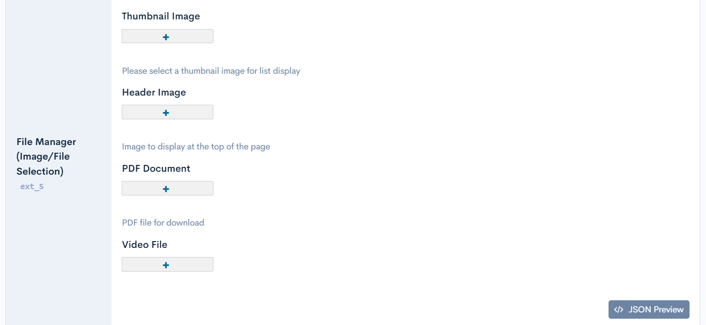
Features:
- Complete integration with CKFinder
- Stores file path as string
- Shows preview link after file selection
WYSIWYG Editor (HTML Editor)
{
  "type": "object",
  "title": "Article Content",
  "properties": {
    "title": {
      "type": "string",
      "title": "Title",
      "minLength": 1,
      "maxLength": 100
    },
    "summary": {
      "type": "string",
      "title": "Summary",
      "description": "Brief description of the article (plain text)",
      "format": "textarea",
      "rows": 3
    },
    "content": {
      "type": "string",
      "title": "Body",
      "description": "Please enter the article body in HTML format",
      "format": "html"
    },
    "sidebarContent": {
      "type": "string",
      "title": "Sidebar Content",
      "description": "Content to display in the sidebar",
      "format": "html",
      "format_options": { "height": "300px" }
    }
  }
}
Display:
Features:
format: "html"automatically displays CKEditor- Specify editor options with
format_options. - Complete integration with CKFinder (image upload & management)
Date and DateTime Input
{
  "type": "object",
  "title": "Date and Time Settings",
  "properties": {
    "publishDate": {
      "type": "string",
      "title": "Publication Date",
      "description": "Please select the date to publish the article",
      "format": "date",
      "nullable": false
    },
    "publishDateTime": {
      "type": "string",
      "title": "Publication Date and Time",
      "description": "Please select the date and time to publish the article",
      "format": "date-time",
      "nullable": false
    },
    "eventStartDate": {
      "type": ["string", "null"],
      "title": "Event Start Date (Required)",
      "description": "Please select the event start date",
      "format": "date"
    },
    "eventEndDateTime": {
      "type": ["string", "null"],
      "title": "Event End Date and Time (Optional)",
      "description": "Please select the event end date and time",
      "format": "date-time"
    }
  }
}
Display Example:
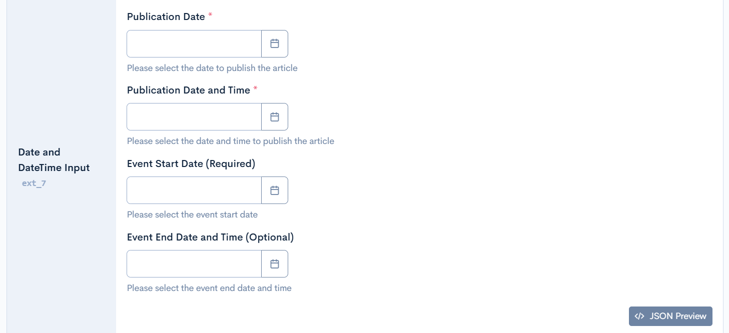
Features:
format: "date": Date only (year, month, day)format: "date-time": Date and time (year, month, day, hour, minute, second)nullable: false: Can be set as required field display- Intuitive selection with DatePicker component
Advanced Configuration Examples
Repeating Fields (Array Forms)
{
  "type": "object",
  "properties": {
    "news": {
      "type": "array",
      "title": "News List",
      "description": "You can register up to 10 latest news items",
      "minItems": 1,
      "maxItems": 10,
      "items": {
        "type": "object",
        "properties": {
          "title": {
            "type": "string",
            "title": "Title",
            "description": "Please enter the news title",
            "maxLength": 100
          },
          "link": {
            "type": "string",
            "title": "Link",
            "description": "Please enter the URL of the news article"
          },
          "publishDate": {
            "type": ["string", "null"],
            "title": "Publication Date",
            "format": "date"
          },
          "category": {
            "type": "string",
            "title": "Category",
            "enum": ["press", "blog", "event", "update"],
            "enumNames": ["Press Release", "Blog", "Event", "Update"]
          }
        },
        "required": ["title", "link"]
      }
    }
  }
}
Display: Repeatable card UI
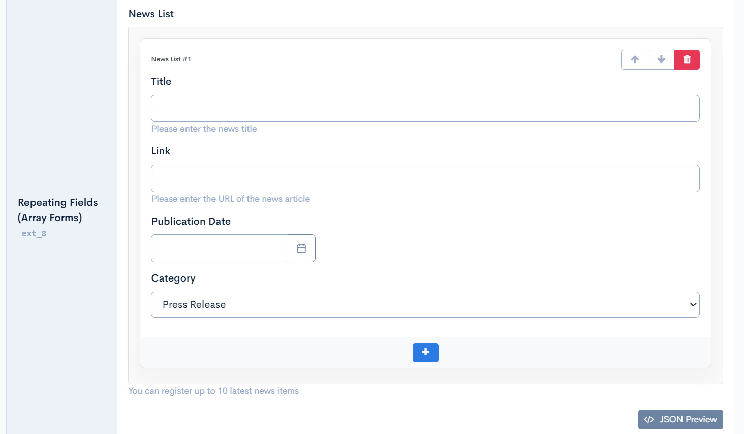
Features:
- Each item is displayed in card format
- Reorder with ↑↓ buttons
- "Add" button placed below each card
minItems: Minimum required items (restriction on deletion, alert displayed)maxItems: Maximum items allowed (restriction on addition, alert displayed)- Verify with JSON Preview button (modal display, read-only)
- description is displayed in small text below each field
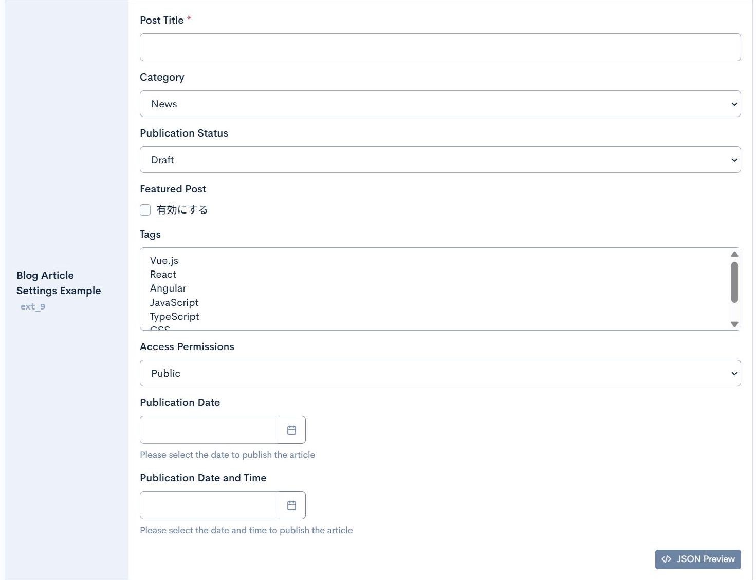
Blog Article Settings Example
{
  "type": "object",
  "title": "Blog Post Settings",
  "properties": {
    "title": {
      "type": "string",
      "title": "Post Title",
      "minLength": 1,
      "maxLength": 100
    },
    "category": {
      "type": "string",
      "title": "Category",
      "enum": ["news", "tutorial", "blog", "announcement"],
      "enumNames": ["News", "Tutorial", "Blog", "Announcement"]
    },
    "status": {
      "type": "string",
      "title": "Publication Status",
      "enum": ["draft", "review", "published", "archived"],
      "enumNames": ["Draft", "Under Review", "Published", "Archived"],
      "default": "draft"
    },
    "featured": {
      "type": "boolean",
      "title": "Featured Post"
    },
    "tags": {
      "type": "array",
      "title": "Tags",
      "items": {
        "type": "string",
        "enum": ["Vue.js", "React", "Angular", "JavaScript", "TypeScript", "CSS", "HTML"]
      }
    },
    "visibility": {
      "type": "string",
      "title": "Access Permissions",
      "enum": ["public", "members", "premium", "private"],
      "enumNames": ["Public", "Members Only", "Premium Members Only", "Private"],
      "default": "public"
    },
    "publishDate": {
      "type": ["string", "null"],
      "title": "Publication Date",
      "description": "Please select the date to publish the article",
      "format": "date"
    },
    "publishDateTime": {
      "type": ["string", "null"],
      "title": "Publication Date and Time",
      "description": "Please select the date and time to publish the article",
      "format": "date-time"
    }
  },
  "required": ["title", "category", "status"]
}
Display Example:
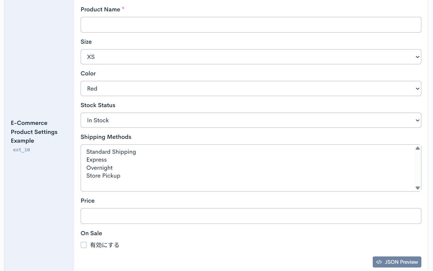
E-Commerce Product Settings Example
{
  "type": "object",
  "title": "Product Settings",
  "properties": {
    "productName": {
      "type": "string",
      "title": "Product Name",
      "minLength": 1
    },
    "size": {
      "type": "string",
      "title": "Size",
      "enum": ["XS", "S", "M", "L", "XL", "XXL"]
    },
    "color": {
      "type": "string",
      "title": "Color",
      "enum": ["red", "blue", "green", "black", "white", "yellow"],
      "enumNames": ["Red", "Blue", "Green", "Black", "White", "Yellow"]
    },
    "availability": {
      "type": "string",
      "title": "Stock Status",
      "enum": ["in_stock", "low_stock", "out_of_stock", "pre_order"],
      "enumNames": ["In Stock", "Low Stock", "Out of Stock", "Pre-order Available"],
      "default": "in_stock"
    },
    "shippingOptions": {
      "type": "array",
      "title": "Shipping Methods",
      "items": {
        "type": "string",
        "enum": ["standard", "express", "overnight", "pickup"],
        "enumNames": ["Standard Shipping", "Express", "Overnight", "Store Pickup"]
      }
    },
    "price": {
      "type": "number",
      "title": "Price",
      "minimum": 0
    },
    "onSale": {
      "type": "boolean",
      "title": "On Sale"
    }
  },
  "required": ["productName", "price", "availability"]
}
Display Example:
Complex Array Example (Product Variations with WYSIWYG)
{
  "type": "object",
  "properties": {
    "productVariants": {
      "type": "array",
      "title": "Product Variations",
      "description": "Register product information by size and color",
      "minItems": 1,
      "items": {
        "type": "object",
        "properties": {
          "sku": {
            "type": "string",
            "title": "SKU",
            "description": "Product code"
          },
          "size": {
            "type": "string",
            "title": "Size",
            "enum": ["XS", "S", "M", "L", "XL", "XXL"]
          },
          "color": {
            "type": "string",
            "title": "Color",
            "enum": ["red", "blue", "green", "black", "white"],
            "enumNames": ["Red", "Blue", "Green", "Black", "White"]
          },
          "description": {
            "type": "string",
            "title": "Product Description",
            "description": "Detailed description of this variation",
            "format": "html",
            "format_options": { "height": "300px" }
          },
          "stock": {
            "type": "integer",
            "title": "Stock Quantity",
            "minimum": 0,
            "default": 0
          },
          "price": {
            "type": "number",
            "title": "Price",
            "minimum": 0
          },
          "image": {
            "type": "string",
            "title": "Product Image",
            "format": "file-manager"
          },
          "available": {
            "type": "boolean",
            "title": "For Sale",
            "default": true
          }
        },
        "required": ["sku", "size", "color", "price"]
      }
    }
  }
}
Display Example:
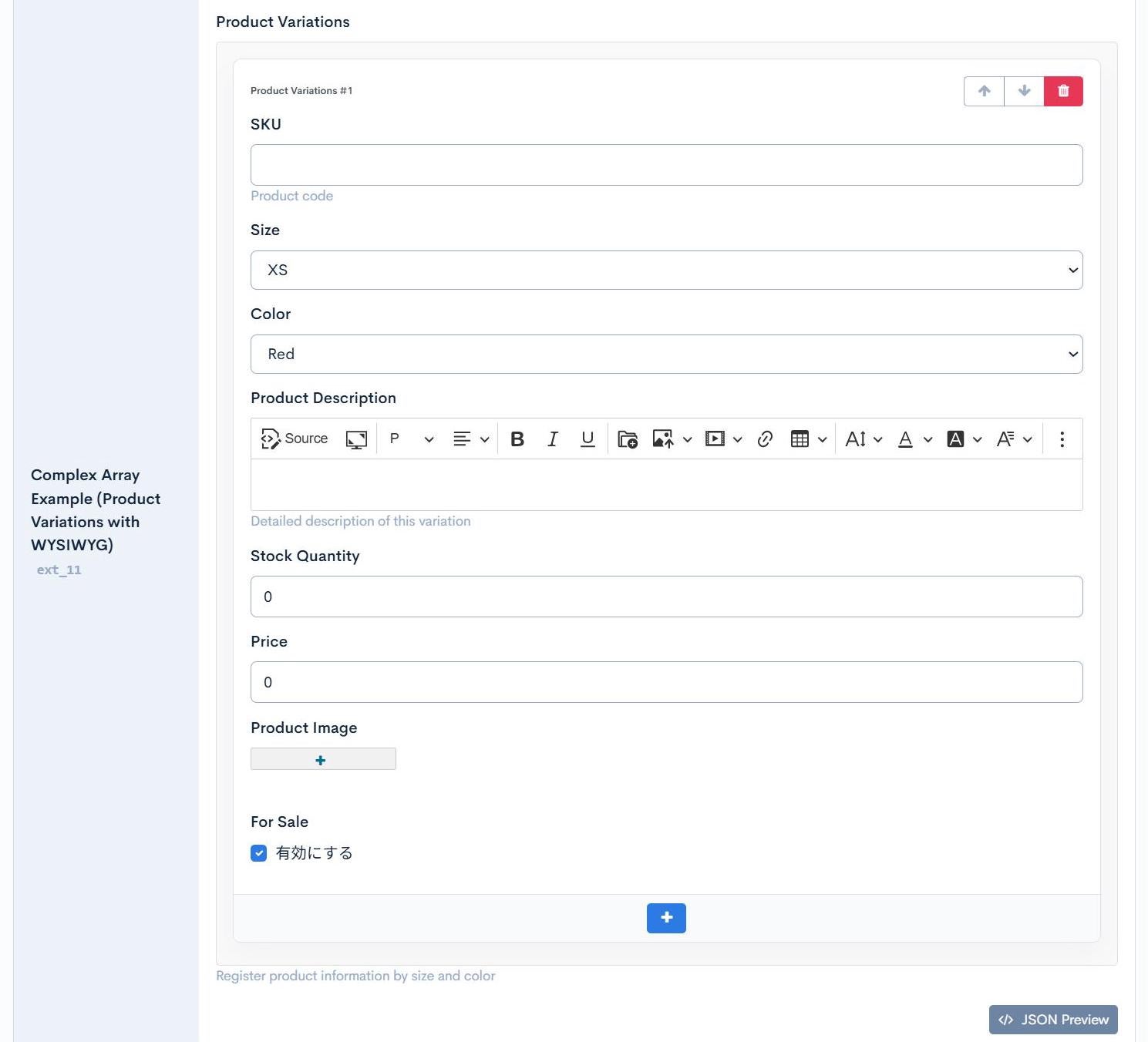
Features:
- WYSIWYG editor can be placed within array objects using
format: "html" - Independent CKEditor instance is generated for each item
- File Manager and WYSIWYG can be used simultaneously
- Individual editor height adjustment with
format_options
Configuration Reference
Display Mode
Build UI from JSON schemaenabled → Display Form UI based on JSON SchemaBuild UI from JSON schemadisabled → Display JSON Editor only
Automatic Field Type Detection
string- Text inputstring+enum- Select boxstring+format: "date"- DatePicker (date only)string+format: "date-time"- DatePicker (date & time)string+format: "file-manager"- File Manager (CKFinder integration)string+format: "html"- WYSIWYG Editor (CKEditor)string+format: "textarea"- Textareanumber/integer- Numeric inputnumber/integer+enum- Numeric select boxboolean- Checkboxarray+items.type: "string"- Comma-separated textareaarray+items.enum- Multi-select boxarray+items.type: "object"- Repeating card UIobject- JSON format textarea
WYSIWYG Editor Options (format_options)
When using format: "html", you can customize the CKEditor behavior using format_options. The following options are available:
| Option | Description | Example |
|---|---|---|
height | Editor height | "height": "300px" |
width | Editor width | "width": "800px" |
toolbar | Toolbar preset. Set to "basic" for a simplified toolbar (bold, italic, lists, link only) | "toolbar": "basic" |
use_markdown | Set to "1" to enable Markdown mode | "use_markdown": "1" |
subscript | Add subscript/superscript buttons | "subscript": true |
strikethroughRelease version: βversion | Add a strikethrough button to the toolbar | "strikethrough": true |
removePlugins | Plugins to remove (comma-separated) | "removePlugins": "insertImage,mediaEmbed" |
use_font_size_px | Enable font size selection in pixels | "use_font_size_px": true |
largeColorPalette | Set to "true" to use extended color palette | "largeColorPalette": "true" |
customColors | Custom colors (comma-separated hex values) | "customColors": "#ff0000,#00ff00,#0000ff" |
use_magicline | Enable MagicLine feature (shows insertion points between elements) | "use_magicline": true |
custom_css | Path to custom CSS file | "custom_css": "/path/to/custom.css" |
resource | Resource path for file uploads | "resource": "/files/user/" |
Example: WYSIWYG with Custom Options
{
  "type": "object",
  "properties": {
    "content": {
      "type": "string",
      "title": "Article Content",
      "format": "html",
      "format_options": {
        "height": 400,
        "customColors": "#2c7be5,#00d97e,#e63757",
        "use_magicline": true
      }
    },
    "sidebar": {
      "type": "string",
      "title": "Sidebar Content",
      "description": "Simple editor for sidebar",
      "format": "html",
      "format_options": {
        "height": 200,
        "toolbar": "basic"
      }
    }
  }
}
Default Value Determination
- If
defaultis set → Use that value - If
defaultis not set:- If
nullis included inenum→ Setnullas initial value - If
nullis not included inenum→ Setenum[0](first value) as initial value
- If
Validation
required- Required fields (for Array/Object types)nullable- Allow null (display required mark when false, for Enum/Date/Number/Integer)minLength/maxLength- Character limit (for String, minLength: 1 displays required mark)minimum/maximum- Numeric rangeminItems/maxItems- Array item count limitpattern- Regular expression pattern
How to Set Required Fields
The method to make a field required differs by field type.
For Enum, Date, Date-time, Number, Integer
{
  "type": "string",  // or "integer", "number", do not allow null
  "format": "date",  // or "enum": ["1", "2"],
  "nullable": false  // ← Required mark displayed when this is false
}
Rule: Setting nullable: false displays the required mark (*). Making type not allow null makes input required.
For String (Text Input)
{
  "type": "string",
  "minLength": 1  // ← Required mark displayed when this is 1 or more
}
Rule: Setting minLength: 1 or higher makes it required and displays the required mark (*).
For Array, Object
{
  "type": "object",
  "properties": {
    "tags": {
      "type": "array",
      "minItems": 1,  // ← 1 or more selections required
      "items": {
        "type": "string",
        "enum": ["1", "2", "3"]
      }
    }
  },
  "required": ["tags"]  // ← Required mark displayed when included in required array
}
Rule: Including the field name in the top-level required array displays the required mark.
Practical Example: Schema with Multiple Required Field Types
{
  "type": "object",
  "properties": {
    "status": {
      "type": "string",  // ← do not allow "null"
      "enum": [null, "draft", "published"],
      "nullable": false  // ← Required mark displayed
    },
    "name": {
      "type": "string",
      "minLength": 1  // ← Required mark displayed
    },
    "publishDate": {
      "type": "string",  // ← do not allow "null"
      "format": "date",
      "nullable": false  // ← Required mark displayed
    },
    "tags": {
      "type": "array",
      "minItems": 1,  // ← 1 or more selections required
      "items": {
        "type": "string",
        "enum": ["1", "2", "3"]
      }
    }
  },
  "required": ["tags"]  // ← For non-Array/Object types, required is determined by property settings
}
Array Object UI Behavior
maxItemscheck when adding items (alert displayed when limit reached)minItemscheck when deleting items (alert displayed when falling below minimum)- "Add" button placed below each card
- Only the first "Add" button displayed when items are zero
Other Features
- Display labels can be customized with
enumNames - Supports Union Type (nullable) like
type: ["string", "null"] descriptionis displayed as help text below the field- Current values can be verified with JSON Preview button (modal display)
Nested Structure Support and Limitations
✅ Supported Nested Structures
The system supports the following nested structures:
1. Object (Single Object)
{
  "type": "object",
  "properties": {
    "name": {"type": "string"},
    "email": {"type": "string"}
  }
}
2. Array → Object (Array of Objects)
{
  "type": "array",
  "items": {
    "type": "object",
    "properties": {
      "title": {"type": "string"},
      "link": {"type": "string"}
    }
  }
}
3. Object → Array → Object (Object containing array of objects)
{
  "type": "object",
  "properties": {
    "news": {
      "type": "array",
      "items": {
        "type": "object",
        "properties": {
          "title": {"type": "string"},
          "category": {"type": "string", "enum": ["blog", "news"]}
        }
      }
    }
  }
}
Explanation: These patterns are fully supported and directly editable in the UI.
⚠️ Limitation: Array → Object → Array → Object
4-level or deeper nested structures (Array → Object → Array → Object) are currently not supported for direct UI editing.
❌ Unsupported Example
{
  "type": "object",
  "properties": {
    "departments": {
      "type": "array",
      "title": "Department List",
      "items": {
        "type": "object",
        "properties": {
          "departmentName": {"type": "string", "title": "Department Name"},
          "employees": {
            "type": "array",
            "title": "Employee List",
            "items": {
              "type": "object",
              "properties": {
                "employeeName": {"type": "string", "title": "Employee Name"},
                "skills": {
                  "type": "array",
                  "title": "Skills List",
                  "items": {
                    "type": "object",
                    "properties": {
                      "skillName": {"type": "string"}
                    }
                  }
                }
              }
            }
          }
        }
      }
    }
  }
}
Issue: 4-level structures like departments (Array) → employees (Object → Array) → skills (Object → Array) create nested repeating UIs within repeating UIs, which are currently not supported.
✅ Recommended Workaround: Split the Structure
When deep nesting is necessary, split into multiple extended fields to handle it.
Solution Example: Split into 2 Extended Fields
Extended Field 1: departments_data (Department and Employee Information)
{
  "type": "object",
  "properties": {
    "departmentId": {
      "type": "string",
      "title": "Department ID",
      "description": "Unique department identifier"
    },
    "departmentName": {
      "type": "string",
      "title": "Department Name"
    },
    "employees": {
      "type": "array",
      "title": "Employee List",
      "items": {
        "type": "object",
        "properties": {
          "employeeId": {
            "type": "string",
            "title": "Employee ID"
          },
          "employeeName": {
            "type": "string",
            "title": "Employee Name"
          },
          "position": {
            "type": "string",
            "title": "Position",
            "enum": ["manager","staff","intern"],
            "enumNames": ["Manager","Staff","Intern"
            ]
          }
        }
      }
    }
  }
}
Extended Field 2: employee_skills_data (Employee Skills Information)
{
  "type": "object",
  "properties": {
    "employeeId": {
      "type": "string",
      "title": "Employee ID",
      "description": "Corresponds to employee ID in departments_data"
    },
    "employeeName": {
      "type": "string",
      "title": "Employee Name (Reference)"
    },
    "employeeSkills": {
      "type": "array",
      "title": "Employee Skills List",
      "items": {
        "type": "object",
        "properties": {
          "skillName": {
            "type": "string",
            "title": "Skill Name"
          },
          "level": {
            "type": "string",
            "title": "Proficiency Level",
            "enum": ["beginner","intermediate","advanced","expert"],
            "enumNames": ["Beginner","Intermediate","Advanced","Expert"]
          },
          "yearsOfExperience": {
            "type": "integer",
            "title": "Years of Experience",
            "minimum": 0
          }
        }
      }
    }
  }
}
Benefits:
- ✅ Each extended field stays within 3 levels (Object → Array → Object)
- ✅ Fully editable in UI
- ✅ Data linked using
employeeIdas key - ✅ Each data set can be managed independently
Data Linking:
- Manage employee basic information in
departments_data - Manage employee skills information in
employee_skills_data - Link both using
employeeId
📊 Nested Structure Support Table
| Structure Pattern | Levels | UI Support | Example |
|---|---|---|---|
| Object | 1 level | ✅ | {type: "object"} |
| Array → Object | 2 levels | ✅ | News list, Product variations |
| Object → Array → Object | 3 levels | ✅ | User info → Order history |
| Array → Object → Array → Object | 4 levels | ❌ | Departments → Employees → Skills |
| Deeper nesting | 5+ levels | ❌ | - |
📝 Summary
- Up to Object: ✅ Supported
- Up to Array → Object: ✅ Supported
- Up to Object → Array → Object: ✅ Supported
- Array → Object → Array → Object and beyond: ❌ Not supported
How to handle when 4+ levels are needed:
- Review data structure and split into multiple extended fields
- Link data with ID fields
- Keep each extended field within 3 levels (Object → Array → Object)
This design pattern allows managing complex data structures while maintaining a fully editable state in the UI.
Support
If you have any other questions, please contact us or check out Our Slack Community.